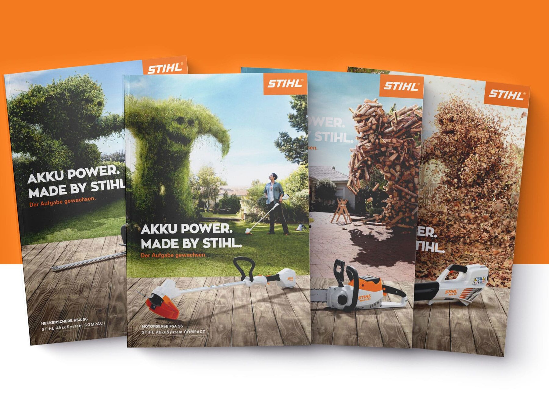
Natürlich benötigt diese neue Produktreihe auch eine passende Plattform. Darum haben wir eine visuell starke Webseite entwickelt, die im digitalen Raum eindrücklich vermittelt, was die Akku-Kraftprotze von STIHL leisten können. Auch im Print wirken unsere Visuals stark.
Element "Cases / Media with Text"
- Text and Media (image or video) split into 2 columns - 1/3 + 2/3 or reversed, based on image alignment;
- Only one Media allowed, Image ratio 4/3
- Text - Body text mandatory, Headline and Subheadline optional (subheadline big and bold text);
- Optional Button/Link;
- Possibility to add padding (spacing) & background color around media (but visible only on desktop - 1024px and above screens);
- Possibility to add column background & text color by using color picker or #hex code;
Made by Stihl
Akku power
Made by Stihl
Akku power
Natürlich benötigt diese neue Produktreihe auch eine passende Plattform. Darum haben wir eine visuell starke Webseite entwickelt, die im digitalen Raum eindrücklich vermittelt, was die Akku-Kraftprotze von STIHL leisten können. Auch im Print wirken unsere Visuals stark.
Made by Stihl
Akku power
Natürlich benötigt diese neue Produktreihe auch eine passende Plattform. Darum haben wir eine visuell starke Webseite entwickelt, die im digitalen Raum eindrücklich vermittelt, was die Akku-Kraftprotze von STIHL leisten können. Auch im Print wirken unsere Visuals stark.
Made by Stihl
Akku power
Natürlich benötigt diese neue Produktreihe auch eine passende Plattform. Darum haben wir eine visuell starke Webseite entwickelt, die im digitalen Raum eindrücklich vermittelt, was die Akku-Kraftprotze von STIHL leisten können. Auch im Print wirken unsere Visuals stark.
subhedaline
Headline
this is some random text