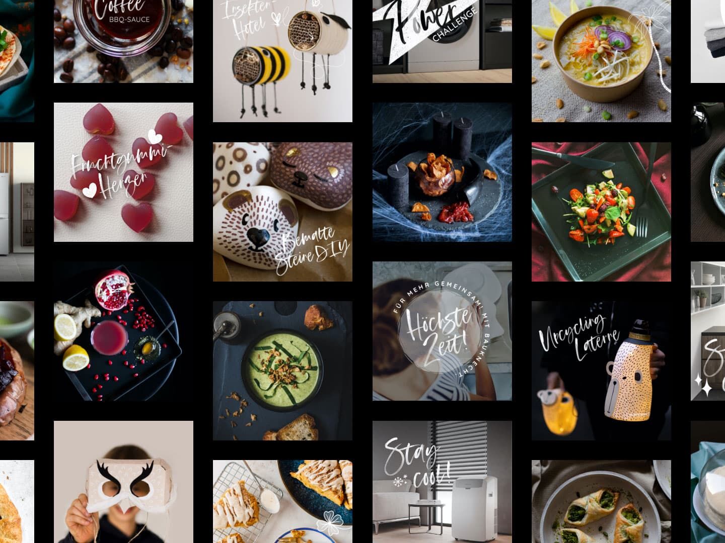
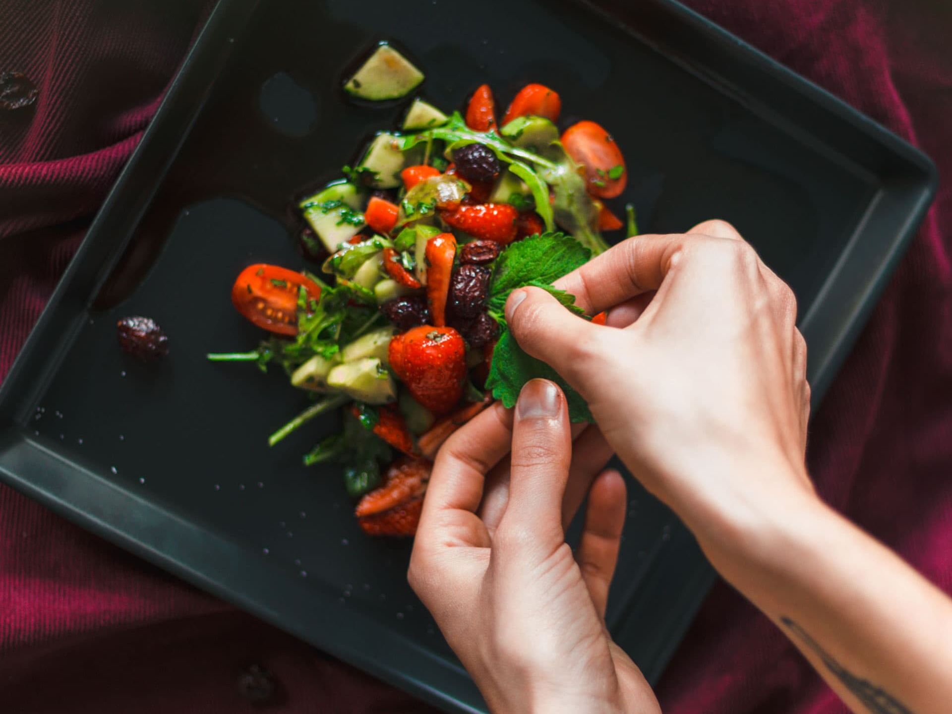
Food, Nachhaltigkeit, Haushaltstipps und Life-Hacks. Selbst zubereitet, fotografiert, animiert oder gedreht. Die Fans von unserem Bauknecht-Kanal werden mit uniquen und außergewöhnlichen Inhalten verwöhnt.
Element "Cases / Media with Text"
- Text and Media (image or video) split into 2 columns - 1/3 + 2/3 or reversed, based on image alignment;
- Text - Body text mandatory, Headline and Subheadline optional (subheadline big and bold text)
- Possibility to add padding (spacing) around "bigger media" (but visible only on tablet/desktop - 810px and above screens);
- Possibility to add column background & text color by using color picker or hex code;
- Image/video ratio 4:3... If the bigger image/video is portrait, it will not scale but keep that ratio;
This element is meant to be used with two media and therefor LESS text. Too much text will get overlapped. If there is too much text, please use the other element "Image Text" which supports one media + optional button/link;
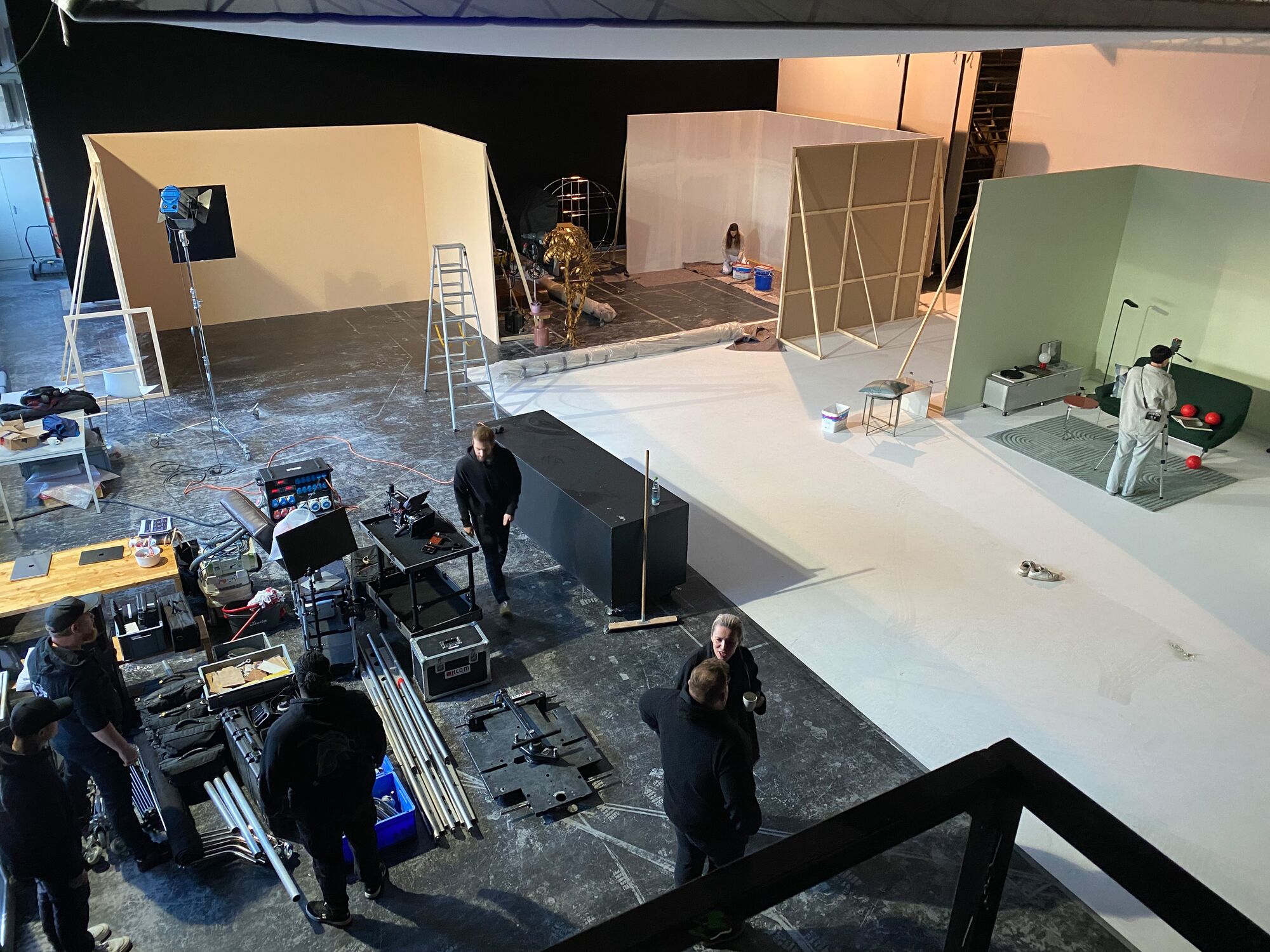
Content Erstellung

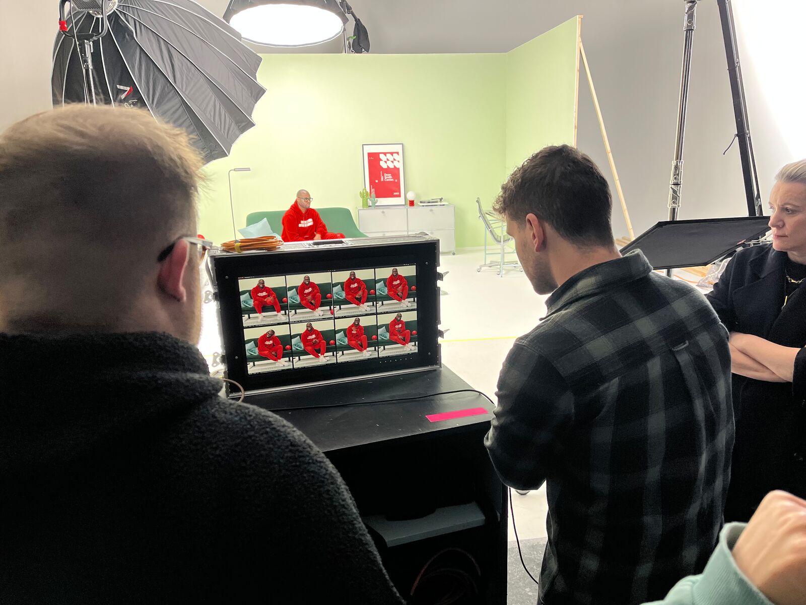
Berlinale 2020
Zum Promi-Treff der Berlinale realisierten wir die Live-Übertragung der Bauknecht Kochshow via Instagram und Facebook. Zudem interviewten wir die Promis zu den Themen Kochen, gesundes Essen und Nachhaltigkeit und kreierten Content für die Social Media Kanäle.
Each color tells a different story (copy)
Die ausdrucksstarke Filmkonzeption und das detailreiche Set Design erlauben uns Content mit Wiedererkennungswert.